Introduction & Goal
At the beginning of my journey at Didar, one of the first challenges we faced was that the user interface conveyed a sense of being outdated. In addition, there was a noticeable lack of consistency and alignment across different parts of the product.
To address this, I initiated a redesign process with the goal of modernizing the interface and reducing visual inconsistencies. Since icons are among the most fundamental UI elements — and have a significant impact on the overall look and feel of a brand and product experience — I decided to start the redesign process with them.
Benchmarking & Ideation
We began the process with benchmarking and ideation. Since simplicity is at the core of Didar’s brand philosophy, the goal was to create icons that felt both minimal and refined.
To inform the design direction, I conducted a detailed review of existing icon packs, including Lucide and Pipedrive. Both packs — in terms of form as well as conceptual approach — were closely aligned with the outcomes we were aiming for, and therefore served as strong references throughout the redesign process.
Sketching
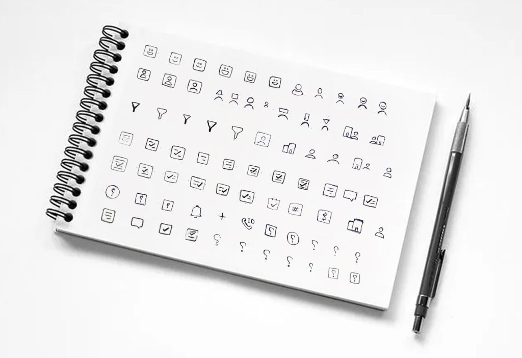
Next, we moved into the sketching phase. For each icon, I created multiple sketches to explore different possibilities and gradually refine the shapes. This iterative process allowed us to identify the most effective and visually balanced forms that matched our design goals.
Design Logic
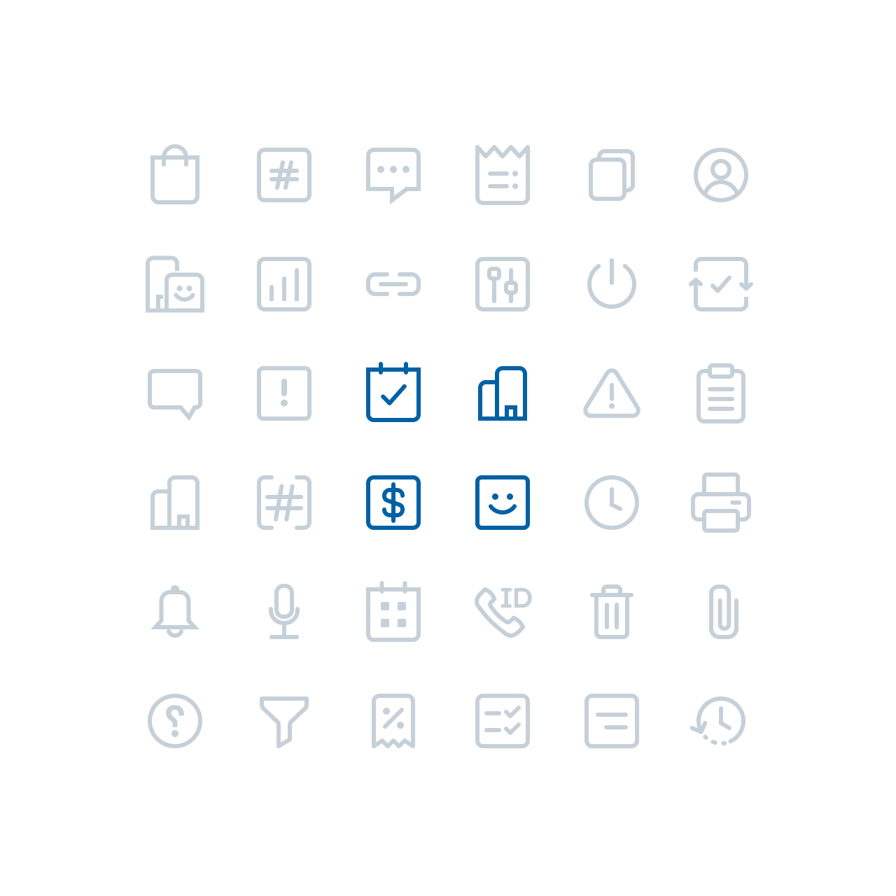
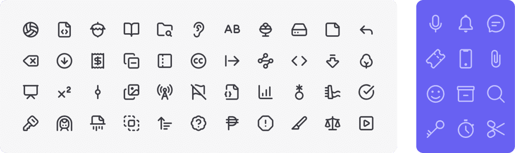
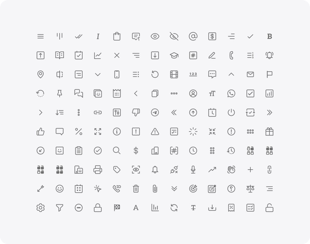
Ultimately, the design logic was built around square and rectangular forms, aiming to convey a sense of formality without appearing overly rigid. As a distinctive signature and to highlight Didar’s unique identity, sharp and angular cuts were occasionally introduced in the corners.

The icons were designed with very thin strokes to reflect cleanliness, elegance, and simplicity. At the same time, special attention was paid to ensuring that this level of refinement did not compromise usability — the icons remain clear, recognizable, and detailed across different screens and sizes.
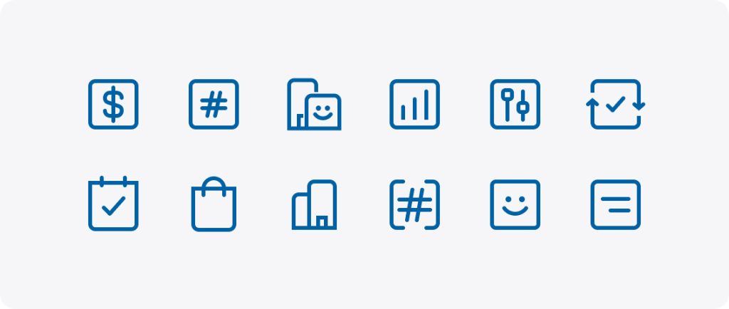
For consistency, the default presentation style of the icon set was defined as outline.
Implementation & Testing
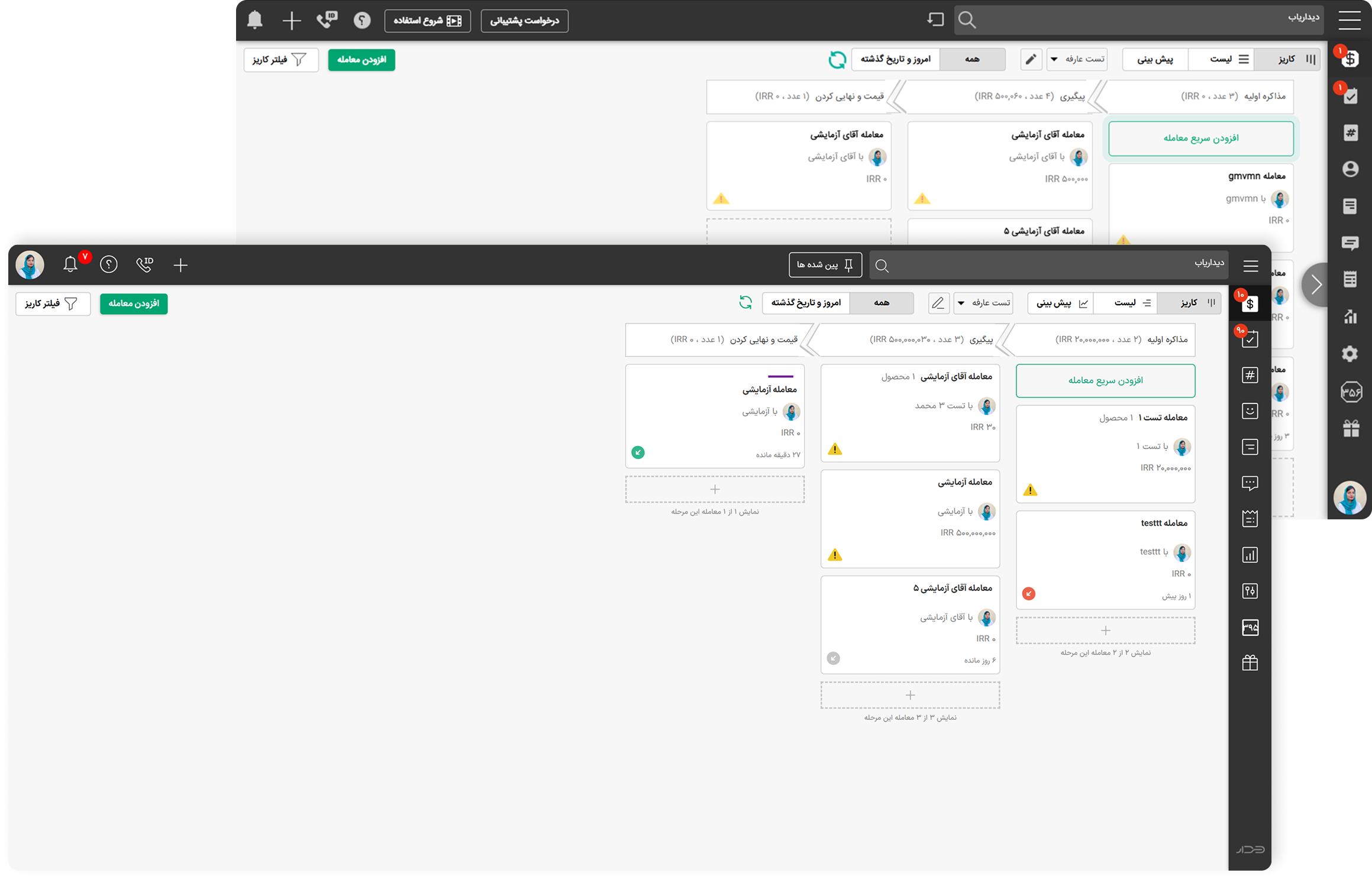
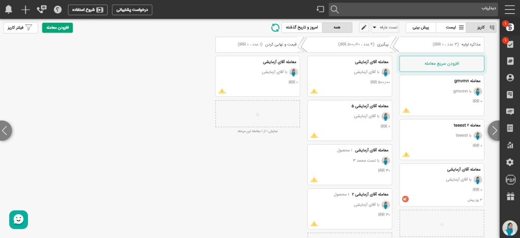
Finally, working in close, step-by-step collaboration with the developer, we integrated each icon into the site and thoroughly tested it in context. This ensured that the icons not only worked well in theory but also enhanced the overall user experience in practice.